
Figma Files Like a Pro
“By failing to prepare, you are preparing to fail.” - Benjamin Franklin
Organizing page structure in Figma is crucial for efficient collaboration, streamlined workflows, and maintaining clarity throughout the design process. A well-structured page layout ensures that team members can easily locate and navigate through different project components, reducing confusion and minimizing errors. Clear organization also facilitates communication by providing a common reference point for discussing project progress and revisions. Additionally, it enhances productivity by enabling quick access to specific design elements and versions, ultimately leading to smoother project execution and higher-quality outcomes.
Page Structure
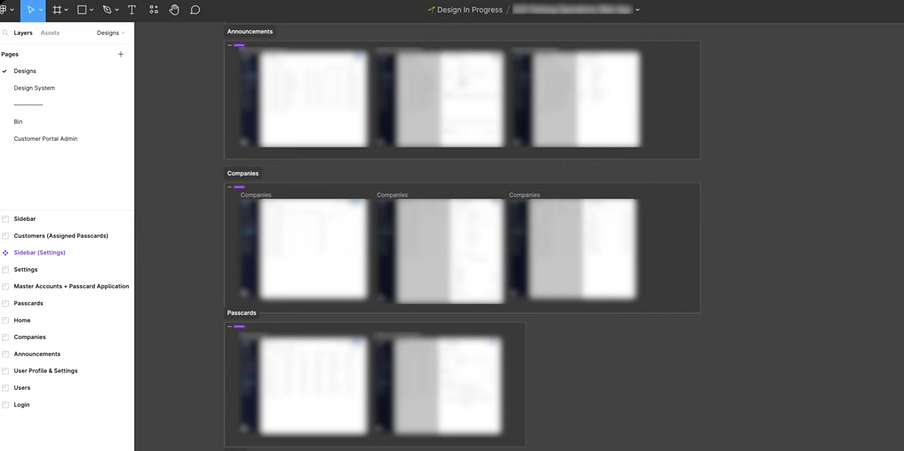
Page structure for my freelance projects. For one Figma file, depending on complexity projects may have the following pages:
-
Cover page
-
Mood board or visual research
-
User research
-
Discovery flow
-
Prototype
-
Local components or design system
-
Designs ready for development
-
Bin or archive page for discarded designs

I organize my designs within the file. I prefer using Figma with a light theme, and I often set the page background to dark gray for better visibility. In this case I use #1F1F1F.
File Cover
Next, I create a covers for my files. My covers include the project status, file name, a brief project description, the team's name, and optionally, a visual representation. For more design ideas, explore the Figma community by searching for "figma file cover."

The file cover should have the following:
-
Status
-
File name
-
Description of the project
-
Team's name
-
Visual of project working on
Page Summary
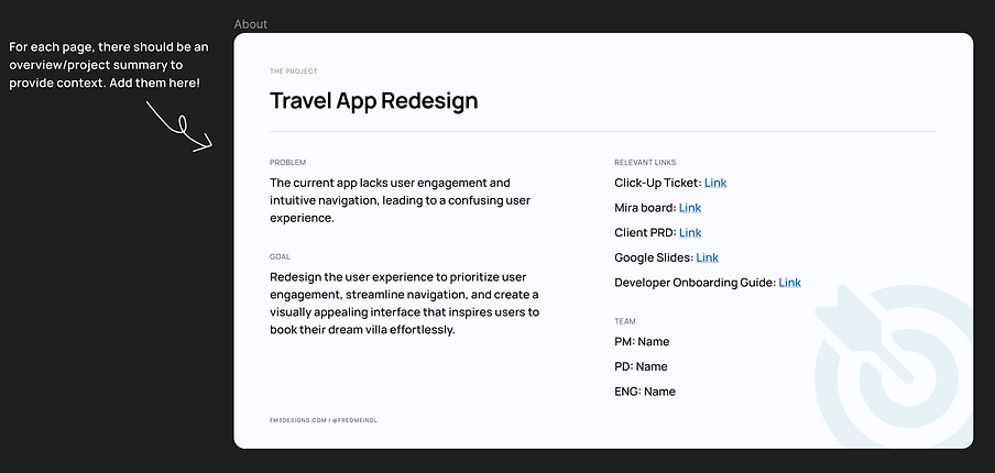
In my designs page, I prefer to include a page summary featuring the project name, the problem goal, and relevant links such as the dev ticket, Mira or other whiteboard, PRD Google Slides, or other pertinent resources. Additionally, I list the names of team members for easy reference in case of questions or inquiries about the design. It's also helpful to provide a developer onboarding guide to assist developers in navigating Figma and exporting icons. Any prototypes that require testing or feedback can be included on this page as well.

Annotations
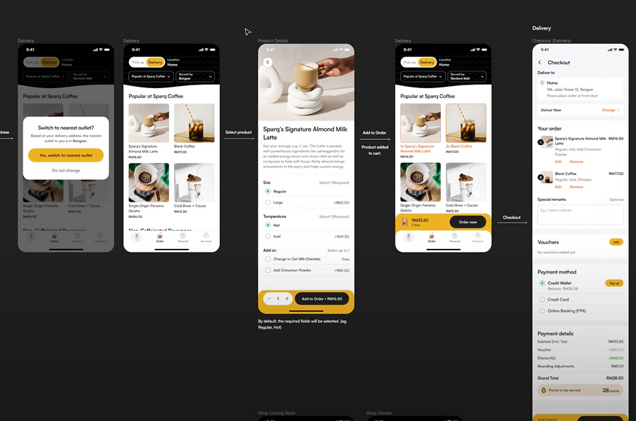
When annotating, I prefer to segment each flow for clarity. If a segment is ready for development, I indicate it with a "Ready for Development" status. Using white text or arrows helps highlight the flow direction. As long as annotations are clear enough for developers or stakeholders to understand the flow, it works. If I've built a Figma prototype for a flow, I'll include a navigation button using a widget for easy access. Simply insert the URL or label it "Figma Prototype" for clear navigation.

Example: Segmented Work Flow

Example: Ready for development status bar

Example: White text and white arrows to show where each screen leads to.
Design Systems Best Practices
Here's how I organize my Design Systems page: Everything is centralized, including logos, colors, fonts, icons, buttons, input fields, and more. For larger projects or organizational workflows, it's best to maintain a separate file dedicated to the design system. In this file, you can publish all assets as components. With the design system library enabled, you can seamlessly plug and play components across different design files. Whenever you update anything in the design system file, simply select the items to publish, and each design file using those components will be notified to review the changes.

Example: Design System
To-Do List and Status Widgets
To manage tasks, I rely on to-do list widgets. It helps me stay organized and keeps everyone aligned on what's completed and pending. In my design files, I incorporate status widgets for each section. I utilize a widget called 'Status Dropdown' by Alexei Shushkov, allowing me to adjust statuses like 'Not Started,' 'Design in Progress,' 'Under Review,' and 'Approved.' Alternatively, I sometimes move sections ready for development to a separate page titled 'Ready for Development,' streamlining the focus for developers to work on those specific designs.

Example: lil to-do widget


Example: Status widget options dropdown

Your designs here!
Example: Status widget
Versioning & Documenting
In your design changes page, your file's version history is automatically saved, allowing you to revisit specific design versions or restore a previous iteration. You can add a version and save it to revert to a particular state. For freelance projects, documenting client comments and design changes is crucial. However, sometimes using the version history might be challenging for clients. In such cases, I prefer duplicating the page and assigning a version number, such as 'Design Project Version 1,' along with a date. This method enables me to clearly document the changes, including what was modified and when it was reviewed.

In Summary
Organizing page structure in Figma is essential for effective collaboration, efficient workflows, and maintaining clarity during the design process. A structured layout enables team members to easily find and navigate through project components, reducing confusion and errors. Clear organization fosters communication, serving as a reference point for discussing progress and revisions. Moreover, it boosts productivity by facilitating quick access to design elements and versions, resulting in smoother project execution and improved outcomes.